The Geography of Time Poverty
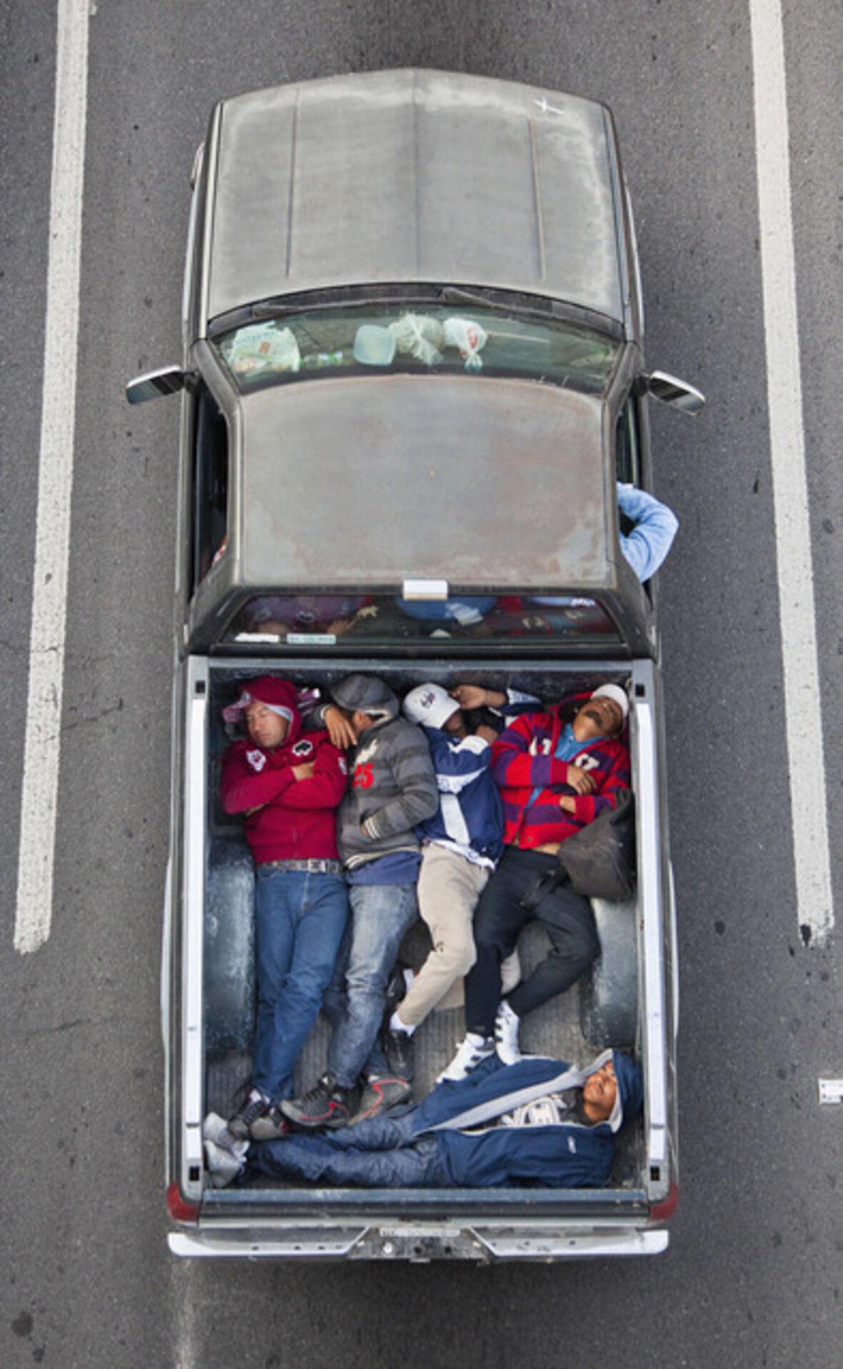
The map says the job is twelve miles away. The clock says something else.
For a worker with a car, the trip may take twenty-five minutes outside peak traffic. For a worker relying on transit, it may require a walk, a bus, a transfer, another bus and a final stretch along a road without a sidewalk. Add the time spent arriving early because missing one connection could mean being late. Add the trip to child care before work. Add the return journey when service is less frequent. The distance is twelve miles. The cost is a daily portion of a life.
Time poverty is what happens when required tasks consume so much of the day that little time remains for rest, care, relationships, exercise, civic life or the unexpected. It is often discussed as a problem of work and household labor. It is also a geographic condition produced by where cities place homes, jobs, schools and services — and by how reliably people can move among them.
In 2024, the average one-way trip to work for U.S. commuters was 27.2 minutes. About 9.3 percent traveled for an hour or more each way.1 Averages hide the shape of the burden. A forty-minute train ride with a seat and predictable arrival is not equivalent to forty minutes split among exposed stops and uncertain transfers. A parent who must collect a child before a closing time experiences delay differently from someone with control over the evening. Ten unreliable minutes can demand a thirty-minute buffer.
Traditional maps are poorly equipped to show this. They privilege physical distance, political boundaries and fixed infrastructure. They make two points look close because they occupy nearby coordinates. But access is not measured in inches. It is measured in doors reached within the time a person actually has.
Transit planners distinguish between trip planning and network awareness. A trip planner answers, "How do I get from here to there?" A network map can answer a larger question: "How much of my city is easily accessible to me?"2 That second question is not merely informational. It shapes where someone applies for a job, accepts an apartment, enrolls a child or agrees to meet a friend.
Frequency is freedom in this geography. A bus that comes every ten minutes allows a rider to arrive without building the day around a timetable. A bus that comes once an hour may technically provide service while exerting control over every connected trip. Reliability matters in the same way. A route on a map is a promise; an unreliable route transfers the system's uncertainty to the passenger.
The unequal distribution of time becomes especially visible at the edges of the day. Early-morning cleaners, hospital staff, warehouse workers, security guards and restaurant employees often travel when transit is sparse. The transportation network may be designed around the conventional peak commute even as essential work follows a different clock. A city can celebrate its twenty-four-hour economy while leaving its night workers to navigate a skeleton version of the public realm.
Housing policy and transportation policy meet inside the same hour. When homes near frequent transit and major job centers become unaffordable, lower-wage workers are pushed farther away and pay part of the housing shortage with time. A cheaper rent may be offset by a longer commute, an additional vehicle or reduced access to opportunity. The household budget records fuel and fares. It rarely records bedtime missed.
What would change if cities mapped time as seriously as they map land use?
Every major plan could include a time-equity analysis: how many jobs, schools, grocery stores, parks and health services can residents reach in fifteen, thirty and sixty minutes by different modes, at different hours? The map should show not only scheduled travel time but transfer penalties, average delay, walking conditions, disability access and the frequency of missed connections. It should be segmented by neighborhood and income, because a citywide average can turn inequality into a smooth color ramp.
The cartographic choices matter. Peterson argues that hierarchy, typography, color and the omission of unnecessary elements determine whether a map communicates or merely contains data.3 A time-poverty map should not reproduce the internal complexity of a transit agency. It should foreground what riders experience: waiting, transferring, exposure, variability and the range of destinations made realistically available.
Policy should then follow the map. Frequent service can be prioritized where people have the fewest alternatives. Affordable housing can be preserved and built near durable transit. Schools and public services can coordinate schedules with how families arrive. Bus lanes can be evaluated not only by vehicle throughput but by hours of human life returned. A shaded stop, all-door boarding or a timed transfer may look small in a capital plan and feel enormous in a daily routine.
Time is one of the most democratic resources: everyone receives a day of the same length. Cities make it radically unequal by determining how much of that day must be surrendered to reach the necessities of life.
The geography of time poverty asks planners to count what transportation models often leave outside the frame. Not simply trips. Not simply minutes. Life unavailable for anything else.
"A route on a map is a promise; an unreliable route transfers the system's uncertainty to the passenger."← Back to The Journal